PublishedDate: 28 March 2025
Nuxt v3 + Tailwindcss v3
為什麼 css 選用 TailwindCSS ,大多數的 css 主題都就是按鈕風格 (button)、輸入欄風格 (title, label, password)、卡片風格(card)。以 button 當範例 <a class="button">按鈕</a> 當需要變更風格時候因為不知道 button 裡面到底有哪些風格,或是不熟悉 css 風格主題時修改會變得很困難。但是 TailwindCSS 就是不一樣,它大概簡化過後的 css ,了解規則後容易使用。
| css | 說明 | 範例 |
|---|---|---|
<span class="p-2">按鈕</span> | 內間距 2px | 按鈕 |
<div class="w-[100]">按鈕</div> | 寬度100 | 按鈕 |
<span class="text-red">按鈕</span> | 紅色文字 | 按鈕 |
<span class="border">按鈕</span> | 邊筐 | 按鈕 |
<span class="rounded">按鈕</span> | 倒角 | 按鈕 |
安裝與測試
- 安裝
npx nuxi module add tailwindcss@6.13.1
- 設定
加入後會自動將 @nuxtjs/tailwindcss 加入 modules
// nuxt.config.ts
modules: ['@nuxtjs/tailwindcss'],
假如沒有加入參考以下內容
// nuxt.config.ts
export default defineNuxtConfig({
  // 其他設定
  future: { compatibilityVersion: 4 },
  modules: ['@nuxtjs/tailwindcss'],
  // tailwindcss 可加入也可以不加
  tailwindcss: {
    exposeConfig: true,
    viewer: true,
    // and more...
  }
  // 其他設定
})
執行
yarn dev輸入網址看展示頁面http://localhost:3000/_tailwind/
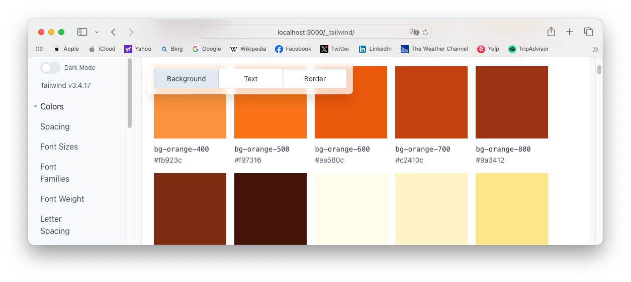
測試 TailwindCSS
- 修改首頁
修改 app/pages/index.vue
<!-- app/pages/index.vue -->
<template>
  <div>
    <h1 class="p-4 bg-red-500">z5525</h1>
  </div>
  <div class="p-4 grid grid-cols-5">
    <NuxtLink
        to="tailwind-demo">
        <span>Tailwind demo</span>
    </NuxtLink>
    <a href="/_tailwind/">
        <span>Tailwind Config Viewer</span>
    </a>
  </div>
</template>
- 加入測試頁面
新增 app/pages/tailwind-demo.vue
<!-- app/pages/tailwind-demo.vue -->
<template>
  <div>
    <h1 class="p-4 bg-red-500">z5525</h1>
  </div>

  <div class="p-4 grid grid-cols-5">
    <div v-for="(c, index) in colors" :class="getTextClasses(index)">{{c}}</div>
  </div>
</template>
<script setup lang="ts">
const colors = [
    "orange-500", "green-500",
    "cyan-400", "pink-400",
    "amber-500","slate-500",
    "yellow-400", "blue-500",
    "red-500", "lime-400",
    "emerald-500", "teal-400",
    "sky-400", "indigo-400",
    "violet-400","purple-500"
]
const getTextClasses = (index) => {
  return `p-4 h-10 bg-${colors[index]}`
}
</script>
bg-red-500 顯示正常,但是其他不能顯示,因為是,這些css主題風格沒有匯入到專案中,所以無法顯示。
我們每次所使用的 Tailwind 主題,有使用到才會匯入與產生,動態產生的css主體,連 p-4 h-10 都無法,這是一個麻煩的問題。
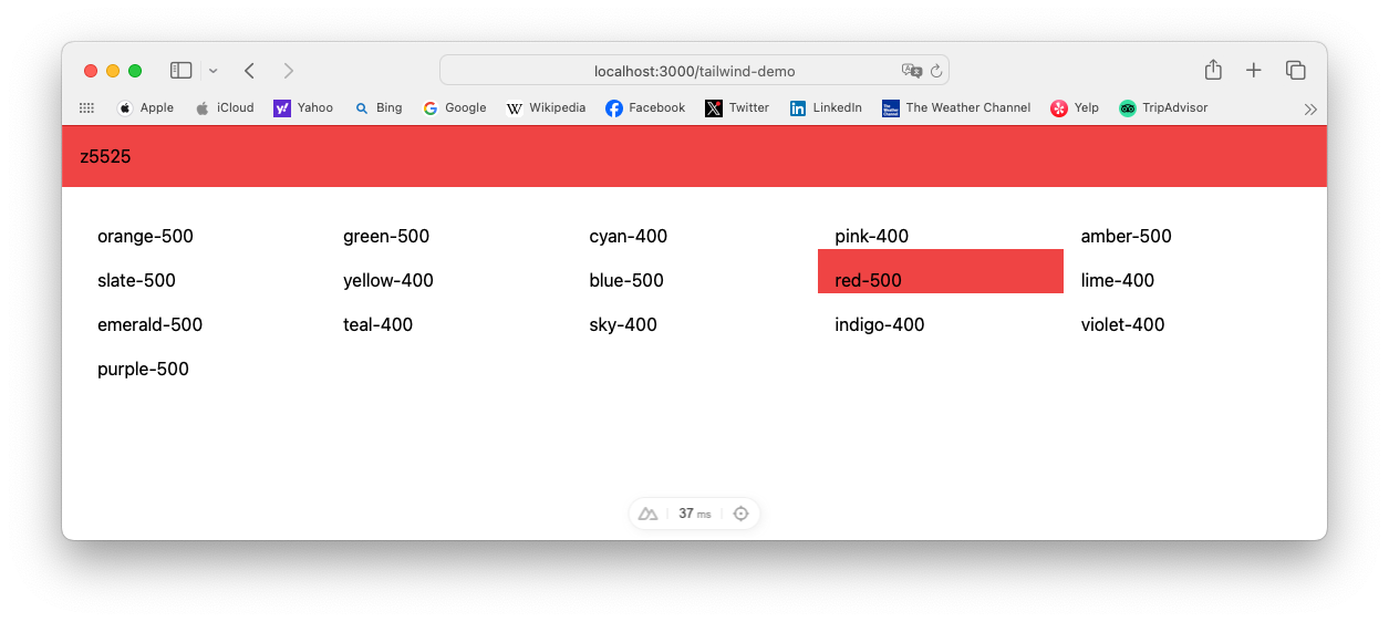
如何快速又方便的顯示
- 目前只找到一個方法是正常有效的,只能在
tailwindcss設定檔中指定
// nuxt.config.ts
export default defineNuxtConfig({
  tailwindcss: {
    config: {
      plugins: [],
      safelist: [
        {
          pattern: /^bg-[\w]*-[0-9]{3}$/
        },
        'bg-green-500', 'p-4', 'h-10' // 或指定 css 名稱
      ],
    },
  }
})
- 重啟專案
yarn dev
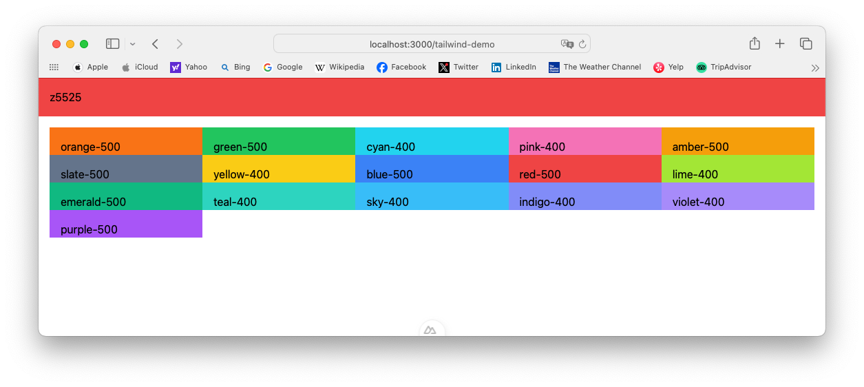
警告訊息
這個警告是因為 safelist0 內的 pattern 屬性是一個 RegExp(正則表達式),但 Nuxt 內部無法序列化它(non-serializable)。
The provided Tailwind configuration in your nuxt.config is non-serializable. Check safelist[0]. Falling back to providing the loaded configuration inlined directly to PostCSS loader.. Please consider using tailwind.config or a separate file (specifying in configPath of the module options) to enable it with additional support for IntelliSense and HMR. Suppress this warning with quiet: true in the module options.
無法序列化這個翻譯很難懂,用 python 解釋當 class 轉 yaml 或 json 的時候都可以寫一個 class 指定序列化(正規化/轉換)將物件內 list, dict, datetime 轉換成指定的文字或數字。 datetime 就是必須轉換成文字或是轉換成 timestamp(數值) 。這個警告是說 nuxt.config.ts 無法正確翻譯 RegExp ,建議在 tailwind.config.ts 設定檔案中使用。
另一種方法設定 tailwindcss 檔案
- 產生
tailwind.config.js
yarn tailwindcss init or npx tailwindcss init
- 在
safelist中加入 css 名稱
// tailwind.config.js
export default {
  content: [],
  theme: {
    extend: {},
  },
  plugins: [],
  safelist: [
    {
      pattern: /^bg-[\w]*-[0-9]{3}$/
    },
    'bg-green-500', 'p-4', 'h-10' // 或指定 css 名稱
  ],
}
以上兩個都是有效的設定,特別注意在
nuxt.config.ts設定資料是在config之後。 實際測試 nuxt.config.ts 設定 RegExp 還是可以成功的使用 bg-xxx-xxx 的風格。
錯誤的方法
這是 AI 給出來的方法結果無法顯示
// 無法顯示
const getTextClasses = (index) => {
  return `p-4 h-10 bg-[${colors[index]}]`
}
Tailwindcss v3 日夜主題控制
- 控制檔案中加入
darkMode: 'selector'
在 tailwind.config.js 控制檔案中加入 darkMode: 'selector'
在 nuxt.config.ts 控制檔案中 tailwindcss.config 加入 darkMode: 'selector'
// tailwind.config.js
module.exports = {
  darkMode: 'selector'
}
// nuxt.config.ts
export default defineNuxtConfig({
  tailwindcss: {
    config: {
      darkMode: 'selector'
    }
  }
})
注意:以上兩個是一樣的,選擇一個設定。
- 新增切換主題共用功能元件
在 composables 目錄之下,新增一個檔名 useTailwindTheme.ts
Nuxt 會自動匯入所有的元件與功能,命名規則使用功能名稱與檔案命名一樣。
// app/composables/useTailwindTheme.ts
export const useTailwindTheme = () => {
  const theme = useState('theme', () => 'light'); // 預設為 light

  const toggleTheme = () => {
    theme.value = theme.value === 'light' ? 'dark' : 'light';
    if (process.client) {
      // 切換 <html> 的 dark-mode 類
      document.documentElement.classList.toggle('dark', theme.value === 'dark');
      // 客戶端儲存 localStorage
      localStorage.setItem('theme', theme.value);
    }
  };

  const initTheme = () => {
    if (process.client) {
      const savedTheme = localStorage.getItem('theme');
      const prefersDark = window.matchMedia('(prefers-color-scheme: dark)').matches;
      theme.value = savedTheme || (prefersDark ? 'dark' : 'light');
      document.documentElement.classList.toggle('dark', theme.value === 'dark');
    }
  };

  return { theme, toggleTheme, initTheme };
};
- 新增開關UI元件
在 components 目錄之下,新增一個檔名 TailwindThemeToggle.vue
<!-- app/components/TailwindThemeToggle.vue -->
<template>
<span
  @click="toggleTheme"
  class="p-button-sm">{{ theme === 'light' ? 'Tailwind Switch to Dark' : 'Tailwind Switch to Light' }}</span>
</template>

<script setup>
const { theme, toggleTheme, initTheme } = useTailwindTheme();

// 初始化主題
onMounted(() => initTheme());
</script>
- 新增一個測試頁面
<!-- app/pages/theme.vue -->
<template>
<div class="p-4 dark:bg-slate-900">
  <div>
    <h1 class="p-4 bg-red-500">z5525</h1>
  </div>
  <div class="p-4 dark:bg-blue-500">
    <h1 class="text-2xl">Tailwind 3 Theme Switch</h1>
    <ThemeToggle />
    <p>這是測試內容,會根據主題切換樣式。</p>
  </div>
</div>
</template>

<script setup>
import ThemeToggle from '~/components/TailwindThemeToggle.vue';
</script>
雖然會自動匯入元件,要自己匯入元件也是可以的。
- 測試
yarn dev
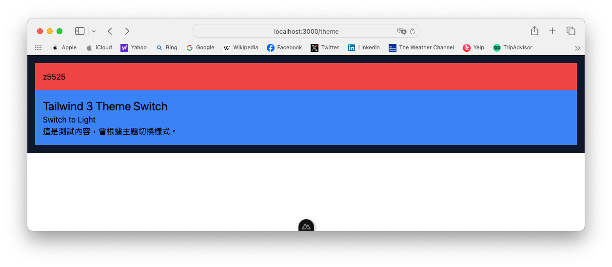
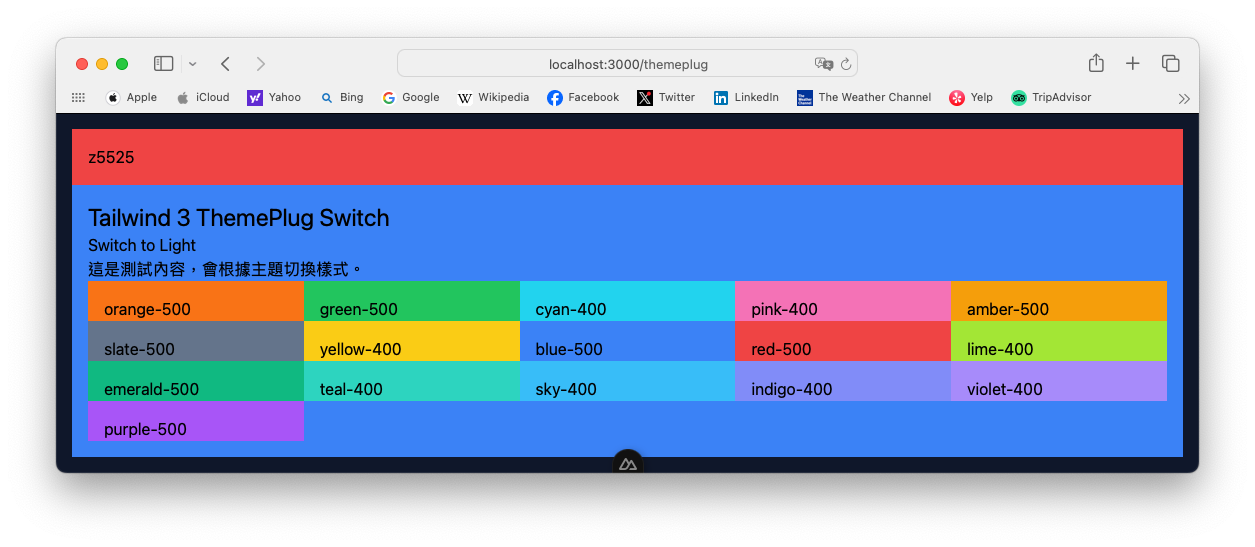
- 加強版測試頁面
<!-- app/pages/themeplug.vue -->
<template>
<div class="dark:bg-slate-100">
  <div>
    <h1 class="p-4 bg-red-500">z5525</h1>
  </div>
  <div class="p-4 dark:bg-blue-500">
    <h1 class="text-2xl">Tailwind 3 ThemePlug Switch</h1>
    <ThemeToggle />
    <p>這是測試內容,會根據主題切換樣式。</p>
    <div class="grid grid-cols-5">
      <div v-for="(c, index) in colors" :class="getTextClasses(index)">{{c}}</div>
    </div>
  </div>
</div>
</template>

<script setup>
import ThemeToggle from '~/components/TailwindThemeToggle.vue';

const colors = [
    "orange-500", "green-500",
    "cyan-400", "pink-400",
    "amber-500","slate-500",
    "yellow-400", "blue-500",
    "red-500", "lime-400",
    "emerald-500", "teal-400",
    "sky-400", "indigo-400",
    "violet-400","purple-500"
]

const getTextClasses = (index) => {
    return `p-4 h-10 bg-${colors[index]}`
}
</script>
所有的顏色都可以正常顯示才是正常的。
Markdown + Tailwind
本章節只講解已經裝好 NextContent 再加入 typography ,關於設定與教學看NextContent第二版 或NextContent第三版。
- 安裝
yarn add @tailwindcss/typography
- 設定
// nuxt.config.ts
import tailwindTypography from '@tailwindcss/typography';
export default defineNuxtConfig({
  // 其他設定
  future: { compatibilityVersion: 4 },
  modules: [
    '@nuxt/content',
    '@nuxtjs/tailwindcss'
  ],
  tailwindcss: {
    exposeConfig: true,
    viewer: true,
    config: {
      plugins: [tailwindTypography],
    }
  },
  // 其他設定
})
- 修改
[...slug].vue
<!-- app/pages/[...slug].vue -->
<script setup>
const { path } = useRoute();
const { data: article, error } = await useAsyncData(path, () =>
  queryContent(path).first(),
)
</script>

<template>
  <!-- Render the blog post as Prose & Vue components -->
  <ContentRenderer :value="article" class="prose prose-pre:max-w-xs sm:prose-pre:max-w-full prose-sm sm:prose-base md:prose-lg prose-h1:no-underline max-w-5xl mx-auto prose-zinc dark:prose-invert prose-img:rounded-lg"/>
</template>
參考資料 Reference
Tailwind CSS module for Nuxt
TailwindCSS
NuxtTailwind
Tailwind CSS Typography
TailwindCSS 官方的教學與 NuxtTailwind 官方教學有些設定不一樣,所有的設定都以 NuxtTailwind 官網為主。
版本備註
nuxt v3.15.4
@nuxt/content v3.3.0
@nuxtjs/tailwindcss v6.13.1
內含 postcss
@tailwindcss/typography v0.5.16